← All projects
Rock.solid
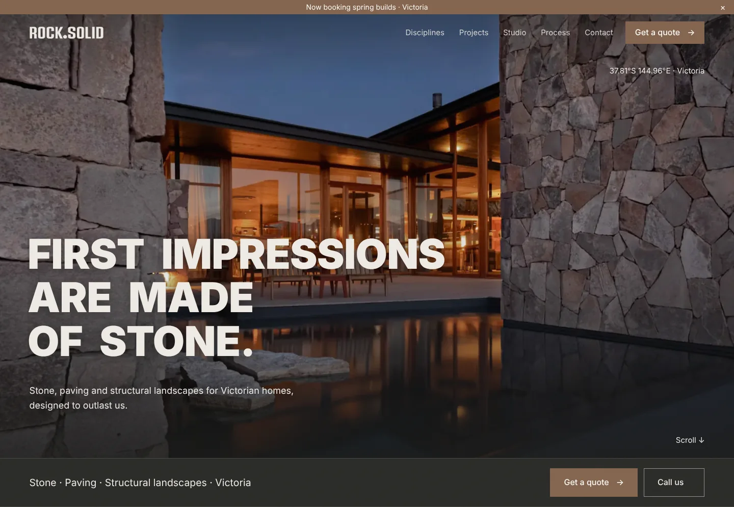
A concept we created for stone, paving and structural landscape crews in Victoria: a brand as solid as the work, and a website that sells the finish.
The work
What we created
A strong, no-nonsense brand for a crew that builds things to last, and a website that turns that confidence into enquiries.
- Logo and brand identityA condensed, heavy wordmark with the weight of stone.
- Colour paletteClay, charcoal and limestone, the colours of the materials themselves.
- Headline and text“First impressions are made of stone.” Written to stop the scroll.
- Site sectionsDisciplines, Projects, Studio, Process and Contact.
- Photography directionDusk photography that makes stone and light do the selling.
- Quote and call buttonsGet a quote and Call us, within reach on every screen.
Brand identity
Built to feel as solid as the work
The wordmark is set heavy and condensed, like a cut block of stone, and the full stop is a single cut stone. The warm clay accent keeps it human and approachable.
Logo

ClayButtons & accents
CharcoalBars & type
LimestoneHeadlines
Typography
LogoA tall, condensed sans in heavy capitals, like stacked blocks. The full stop is a single cut stone.
HeadlinesA wide, heavy sans in capitals, set big over the photos. Short lines that read like a statement.
Text and buttonsA clean, simple sans in sentence case. Calm next to the headlines, and easy to read on a phone.
Your business could be next.
Logo, brand and website, designed around your work. Start with a free website audit.